This is a self-directed project. I wanted to work backwards from a real customer problem on a product I use, apply the kind of research and design process I'd use on the job, and show my thinking. It is not affiliated with Amazon.
Prime Video Watchlist
Timeline
2025
Role
Independent UX research and design
Scope
Speculative TV app redesign
Platforms
TV (Fire TV, Apple TV, Smart TVs)
Speculative case study
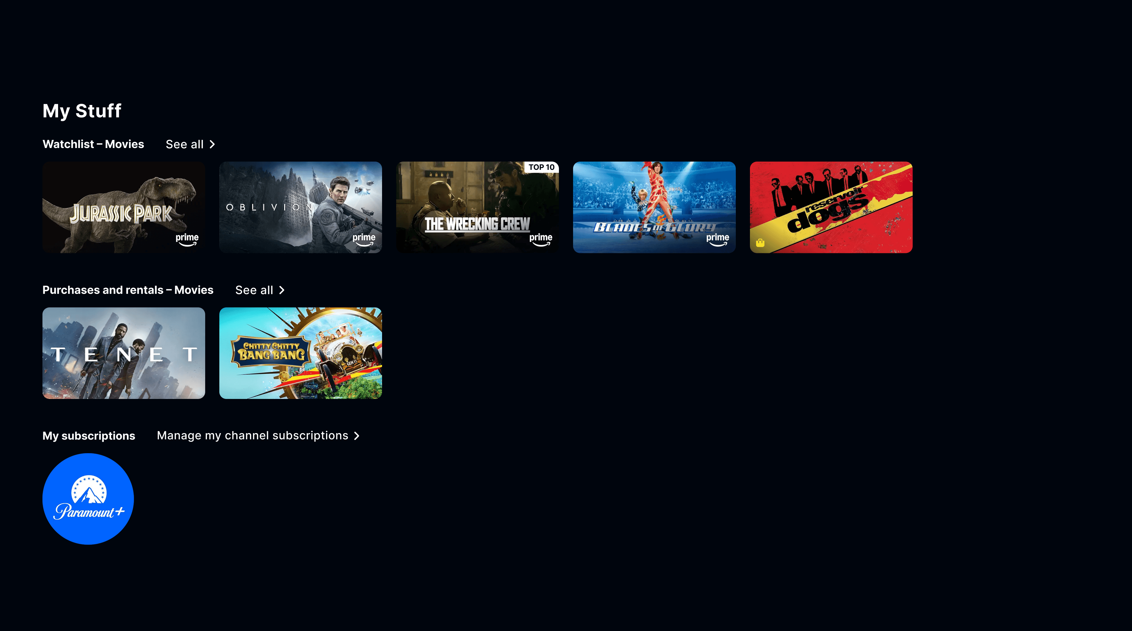
Amazon redesigned Prime Video in July 2024. The homepage got smarter. The watchlist stayed exactly the same.
Problem
Prime Video's watchlist has no filtering by genre, mood, or runtime. No sorting beyond the default order. No way to tell what's about to leave Prime or what you saved six months ago and forgot about.
On TV apps, where most viewing actually happens, the experience is worse. It's a horizontal scroll and nothing else. You can remove a title or watch it. That's the full feature set.
The result is predictable. People save content with good intentions, come back to a wall of thumbnails, scroll for a while, and either rewatch something familiar or give up. The watchlist becomes the problem it was supposed to solve.
Research
I spent time validating that this was a real problem people actually complain about, not something I was projecting. I pulled from post-redesign articles, app store reviews, Reddit threads, and compared how Netflix, Disney+, and Crunchyroll handle the same feature.
The most interesting finding was that Amazon already built filtering for the web version. The browser app has All / Movies / TV Shows tabs and a sort dropdown. The TV app has none of it. The solution is partially built. It just hasn't reached the screen where customers actually watch.
- “[The watchlist] has gotten so bloated it's almost as frustrating flipping through it as it is finding something to watch in the library.” (How-To Geek, November 2025)
- “The streaming device or smart TV apps [are] the worst.” (How-To Geek, November 2025)
- “It doesn't help much when you still have to scroll through hundreds of other items when you're in the mood for a specific movie.” (Yahoo, September 2025)
- “When I launch Prime Video, the very first thing I should see is a list of things I was recently watching and did not finish.” (Reddit, r/AmazonPrimeVideo)
All of these are from after the July 2024 redesign. The homepage improved. The watchlist didn't.
I used AI to cluster and synthesise the qualitative data from these sources. It cut what would have been a few hours of tagging and grouping down to about twenty minutes.
Design approach
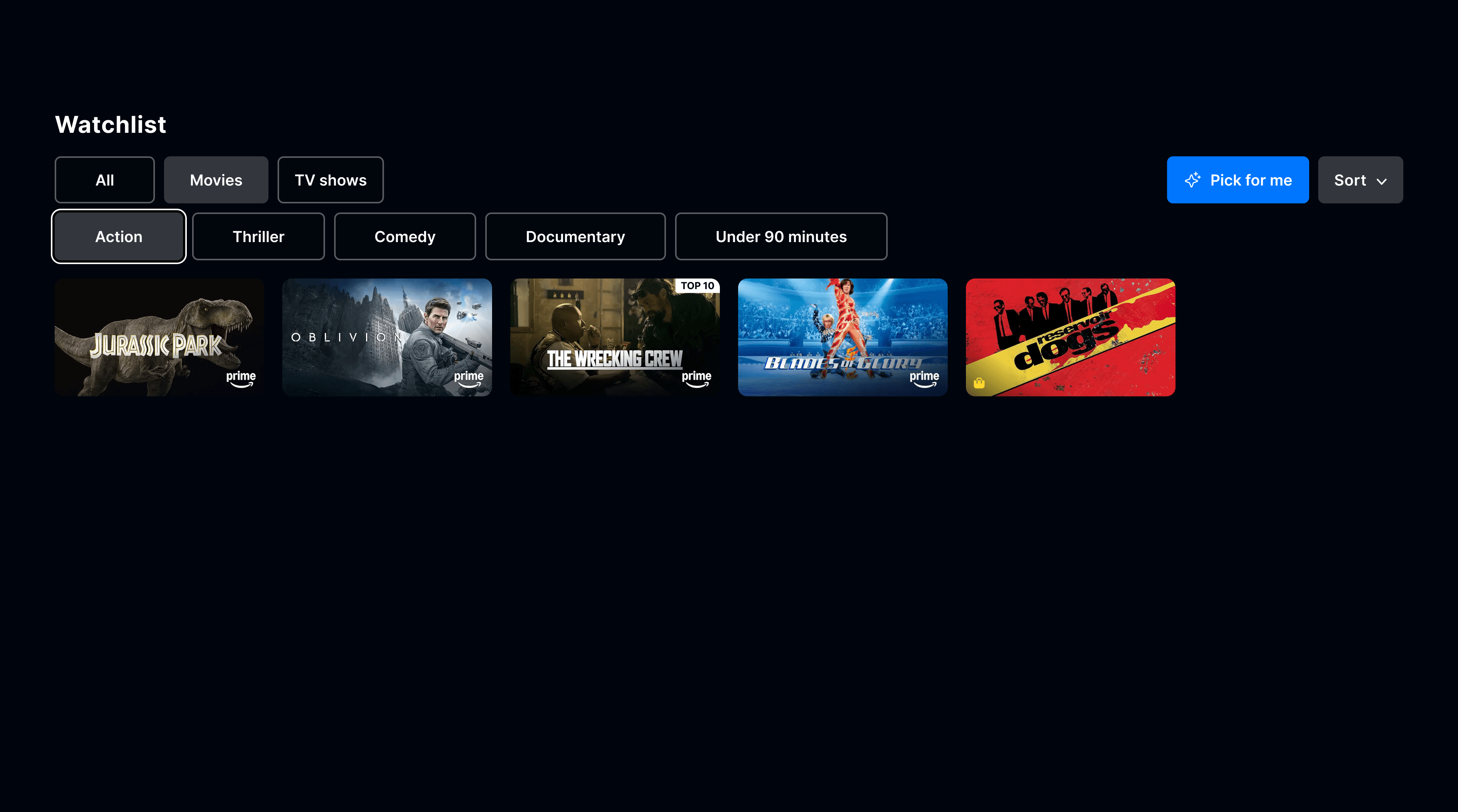
I started from the customer experience I wanted to see, then worked backwards to what needed to change. The goal was not to reinvent the watchlist. It was to finish what Amazon started on web and add a layer of intelligence on top.
First, I brought across the web features that are missing on TV. The All / Movies / TV Shows tabs and sort dropdown already exist in the browser. Their absence on TV is a shipping gap, not a design gap.
Second, I added genre and runtime filtering. Horizontal filter chips for Action, Thriller, Comedy, Documentary, and an “Under 90 mins” option let customers narrow their list to what fits their mood and how much time they have. The selected state matches the active tab styling so it reads as one system.
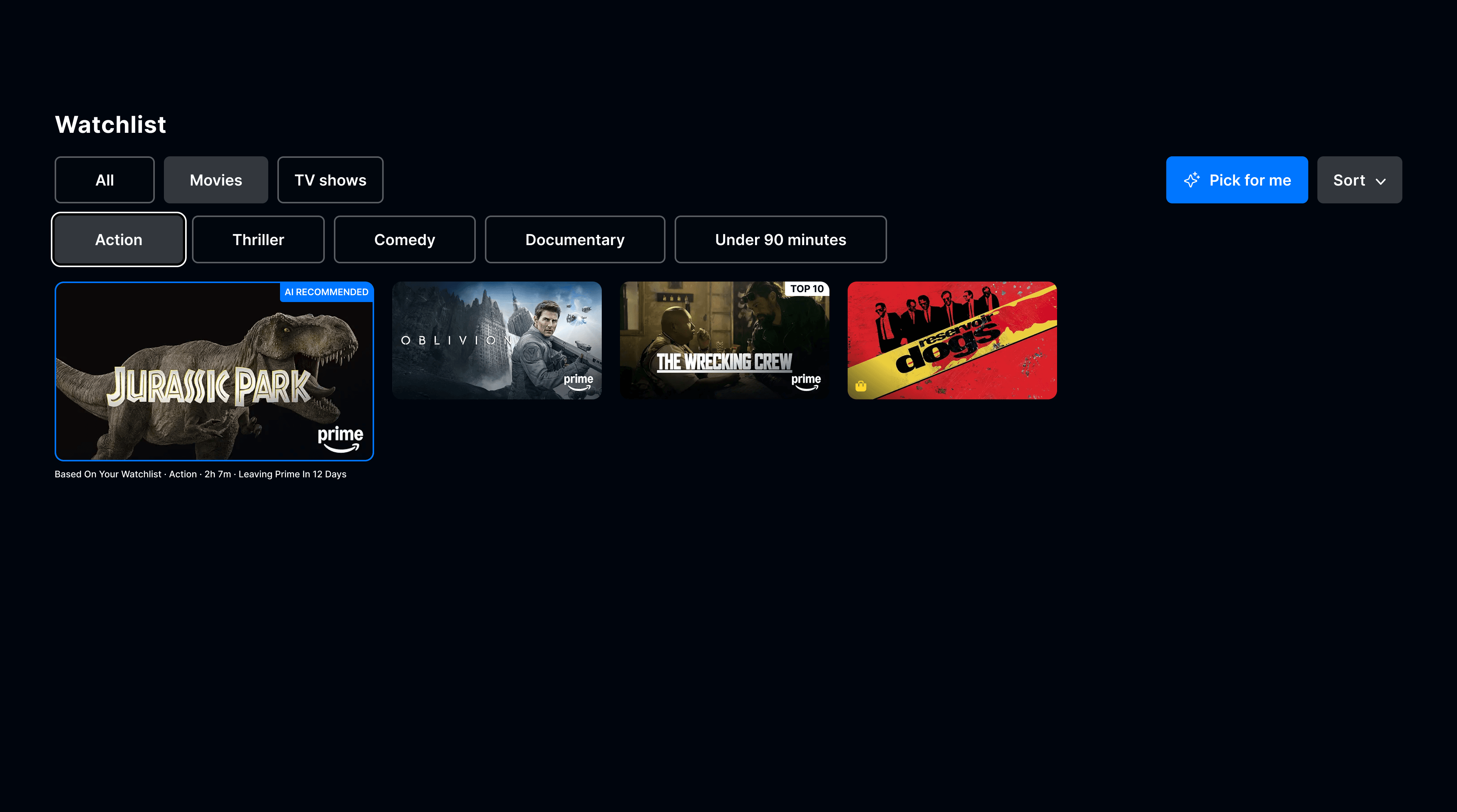
Third, I added a “Pick for Me” feature. It uses contextual signals (how long ago you saved something, whether it's about to leave Prime, your genre preferences, runtime) to recommend a single title from your own watchlist. The recommendation comes with a reason: “Based on your watchlist. Action. 2h 7m. Leaving Prime in 12 days.”
Amazon already uses Bedrock for personalised recommendations on the homepage after the 2024 redesign. The same infrastructure could power this without new platform investment.
Design decisions
The active filter chip uses the same filled grey as the active Movies/TV Shows tab. I wanted one filter system, not two components that happen to sit near each other. The “Pick for Me” button stays blue because it's an action, not a filter state. Grey means “viewing this subset.” Blue means “do this for me.”
The AI feature recommends one title, not a row of suggestions. People already have their own list. Adding another list of recommendations would compound the decision problem. A single pick with a clear reason is a decision made, not more options to evaluate.
I added contextual badges to cards: “Leaving Prime in 7 days” and “Saved 6 months ago.” These create natural priority without asking the customer to remember when they saved something or check what's about to rotate out of the catalogue.
Constraints
This concept was designed at web fidelity. Shipping it on TV would need more work:
- D-pad navigation testing for the filter chips and Pick for Me button, with clear focus rings and sensible tab order
- Larger targets and focus states for 10-foot UI at sofa distance
- Performance testing for client-side filtering on lower-powered smart TV hardware
- An experimentation framework to measure whether AI-assisted picks actually change watch behaviour (Amazon runs thousands of A/B tests a year, so the infrastructure exists)
I don't think acknowledging what you haven't solved makes a concept weaker. It shows you know what the next iteration looks like.
Measuring success
Amazon distinguishes between input metrics (things you directly control) and output metrics (the results those inputs drive). For this feature, I'd frame it the same way.
The input metrics are the ones the team can act on: filter usage rate, Pick for Me tap rate, and the percentage of customers who see a recommendation badge and interact with it. These are directly controllable.
The output metrics are what those inputs should move: titles watched from the watchlist per customer, time-to-play after opening the watchlist, and watchlist abandonment rate (opening it without watching anything). If customers are finding what they want faster and watching more of what they saved, the feature is working.
Reflection
The interesting thing about this project is that the hard part was already done. Amazon built filtering for web and didn't ship it to TV. The opportunity is less about invention and more about closing the gap, then adding the intelligence layer on top.
The research took less than an hour and gave me enough evidence to design with confidence. I keep coming back to the fact that the strongest design opportunities often look like this: not a missing feature, but a feature that exists in one place and hasn't made it to where customers actually are.